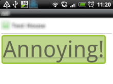
For a while now, I’ve been finding the green highlight / box that the Android WebView displays when you click something particularly annoying.

I understand why it’s there and UI feedback is definitely an important part of mobile design, but a lot of the time I like to take care of that myself and I find the green boxes can really spoil the user experience. Particularly when using buttons & form elements and anything involving Canvas.
It’s been a mild thorn in my side for a while, but today I finally decided to look into it and it turns out the solution is remarkably simple.
First of all, all credit goes to Stack Overflow. I’m not trying to steal credit, please go there and vote the solution up (I already have); but did it take some Google-Fu to find it and so I’m hoping by posting it here I might make it easier to find.
Anyway, onto the solution, which is just to add the following to your pages stylesheet:
`* {-webkit-tap-highlight-color: rgba(0, 0, 0, 0);}`For example, so that:
<!DOCTYPE html>
<html>
  <head>
  </head>
  <body>
    <a href="" style="font-size:4em;">Annoying!</a>
  </body>
</html>
Becomes:
<!DOCTYPE html>
<html>
  <head>
    <style type="text/css">
      * {-webkit-tap-highlight-color: rgba(0, 0, 0, 0);}
    </style>
  </head>
  <body>
    <a href="" style="font-size:4em;">Annoying!</a>
  </body>
</html>
Fantastically simple. And that stops the green boxes dead.
It does seem to be on a page-by-page / per stylesheet basis though and also it is all or nothing (you can’t override the selection colour by changing the rgba, you can only seem to disable it as above), but that’s all I want, so I’m happy :)
